Ab (miniature) by Alicia Bailey
'Designed, illustrated & hand bound in a limited edition of 25 ... by Alicia Bailey. [From] Suggestions for improving the heart and its workings, Aubri Aleka Keleman, © 1997."--Colophon.
"This small book is bound in millimeter style with a maroon leather spine and Pamela Smith hand marbled papers on the covers. The title label is gold laserfoil printed on the same marbled paper and inset. Each of the 32 pages is hand painted with inks on Sumi paper. Text is laserprinted. Title page is heat embossed Gocco print with hand painting on Nideggan paper. The wraparound case is of burgundy book cloth and lined with Smith marbled paper with a complementary pattern to book's cover. The case cover is Gocco printed in gold. Illustrations and book design by Alicia Bailey. Ab means, in Aramaic, "the breath of life." The text of this book includes descriptions of the physiological workings of the circulatory system and Aubri Aleka Keleman's poem "Suggestions for Improving the Heart and Its Workings."--Vamp & Tramp, Booksellers website (accessed Feb. 26, 2014).

1790 Puzzle Purse Valentine (Alice Simpson)
Continuing in a forty-six year tradition of creating original Valentines, Alice Simpson has created a Victorian style puzzle purse with 17th-Century style alphabet, offset printed in Monadnock Dulcet 100 lb. with 17th Century print and Zapfino fonts. Edition of 100.


Admonition (Sara Parr)
- Admonition byMinneapolis, Minnesota: Sara R. Parr, 2007. Second Edition of 16.
2 x 3" closed; 9 x 8" open. Single sheet snake format construction. Laid in stiff paper wrap with envelope slip-in closure. Monoprint and photolithography on Kitikata paper. Hoefler Text font. Signed and numbered by artist.
Unfolds to reveal the image of a heart and the words from Sylvia Plath's "Admonition" in expressive typography: "If you pluck out the heart / To find what makes it move. / You'll halt the clock / Than syncopates our love…."


Alchemy (Roni Gross)
- Alchemy byCall Number: Moody Polk Books N7433.4.G77 A43 2008Publication Date: 2008Description [10] leaves : ill. ; 16 x 14 cm.
Note "Running throughout is the text of the Emerald Tablet, the central text of the Hermetic tradition, otherwise known as The Secret of Hermes. It was believed by European alchemists to hold the secret for transformation of the self and the transmutation of substances."--Colophon.
"Printed on Chautara Lokta and Nepalese Batik papers and set in poliphilus, sonyanna script and trajan type faces. Edition of 50 copies."--Colophon. Baylor's copy is number 3 and is signed by the artist.
In self-folding envelope with embossed picture of bain-marie on cover.
Title from artist's web site; imprint from colophon.

Bequeathe Love (Cari Ferraro)
Bequeathe love : poetry / by Walt Whitman; in a book made by Cari Ferraro

"Concertina-folded. Reproduced from original watercolor painting and calligraphy. Printed two-sided with archival pigment inks on Arches Text Wove paper. Wrapped in heavyweight handpainted paper. Ribbon closure."--Vamp & Tramp, Booksellers website (accessed Feb. 26, 2014).
"The book is of a size which may be held in the hands and read while turning pages, or displayed out of its wrapper for the full painting. The pages make interesting use of the writing in the landscape, for instance, the fold breaks 'bequeathe love' into 'the love' on one page spread. The landscape writing was made in the wet paper before paint was applied, allowing it to become the land, sky and wind of the earth."--Artist's statement, Vamp & Tramp website (accessed Feb. 26, 2014).
"This is the first printing of 17 copies in an open edition."--Colophon. Baylor's copy is number 14 and is signed by the artist.
Book of Hearts (Marian Crane)
Book of Hearts by Marian Crane (2014)
" . . .Book of Hearts is a 'non-verbal Valentine of geometric and botanical hearts.' It is a small, gorgeous one-of-a-kind book made with wooden pages, burned heart designs and vibrant red tassels and beads." (23 Sandy Gallery)

The book of love / [printed by Marina Acona and Laimah Osman ; translated by Wazmah Osman and Abdullah Osman].
[New York : Persian Poetry Project : 10 Grand Press], c2011.
"Ishqnama/The Book of Love is silkscreen and letterpress printed ... in an edition of 50 copies. Each book is unique, numbered and signed. Type and imagery are inspired by the classic Shahnama/The Book of Kings manuscripts."--Colophon.
|
Accordion folded with 4 pockets on one side. Each of the the first three pockets contains a poem in English and Persian, printed on 2 leaves, bound together on one side. The 4th pocket contains the colophon printed on one leaf.
|
Box of Eros by Alicia Bailey
- Box of Eros byCall Number: Moody Polk Books N7433.4.B33 B69 2008Publication Date: 20084 v. : col. ill. ; 12 x 9 cm.
"A collection of 24 erotic haiku commissioned by Ravenpress for this project, housed in a lidded box. Artwork by Heidi Zednik. Includes haiku by Alicia Bailey, Jocelyn Esch, Steve Gordon, Paul Guitterez, Kim Harrell, Carson Reed, Susan Vaho & Heidi Zednik. This is an open and variable edition. --Alicia Bailey's website (accessed October 30, 2013)
Baylor's copy is number 5 of an open edition.

Chansonnier de Jean de Montchenu
- Chansonnier de Jean de MontchenuFacsimile edition of the 15th century (ca. 1460-1477), heart-shaped Chansonnier de Jean de Montchenu (Ms. Occ. Rothschild 2973) housed in the Bibliothèque nationale de France.
Polyphonic chansons for 2-4 voices. Contains French and Italian (and some Spanish) secular pieces by or attributed to Barbingant, Fedé, Bedingham, Dufay, Dunstable, Binchois, Frye, Busnois, Caron, Cornago, Ghizeghem, Morton, Ockeghem, Vincenet and others.
Commentary on manuscript housed in Crouch under call number: ML2802 .F35 2008.Recorded excerpts from the manuscript are housed in Crouch under call number: CD ENCH 1.


Cherished, Beloved, and Most Wanted (Maureen Cummins)
Cherished, Beloved, and Most Wanted by
Materials: found antique photograph albums, found photographs. Each photo album is unique and includes a separate archival envelope, the "rejected" family photographs it once contained. Album photographs laser printed. Title page letterpress printed. Limitation or colophon letterpress printed.
Maureen Cummins: "Altered Victorian photo albums are paired with reproductions of mug shots from a police ledger, circa 1930. These textless books are experimental rather than didactic (other than title and colophon pages, the book is comprised of photographic spreads) and inspire in the viewer a process of examination, out of which questions and observations - about history, crime, the family, and the process of collecting itself - naturally arise.
"Ironically however, the cabinet cards originally intended for these albums (thick photographic cards depicting cherished friends and family members) are now virtually worthless, while convict photos have become a rare and costly collectible. By placing them within prized family photo albums, the artist alludes not only to this telling fact of material culture, but to a myriad of related phenomenon: the Freudian analysis of language and imagery by criminal groups, and our own inconsistent attitude about crime and criminals. While we fear and demonize criminals, we are also secretly fascinated by them, often to the point of celebration: we adopt glamorous figures such as Jesse James, Billy the Kid, and Bonnie and Clyde, claiming them as part of our cultural heritage, at the same time that we disown, deny, and revile other common or less romantic criminals.
"Meanwhile, the quiet pleasure provided by leafing through family photo albums has been replaced by our obsessive involvement with mass media. Violence is our new entertainment; and criminal families from the Corleones to the Sopranos have entered our hearts and homes, inviting us to pore over their images and recall their words and deeds with fondness."


Concrete Love (Aimee Lee)
- Concrete Love byCall Number: in processingPublication Date: 2010thaca, New York: Aimee Lee , 2010. Edition of 2 + AP .
6 x 4"; 38 pages. Pen on handmade mulberry paper and cochineal dyed hanji (handmade Korean paper). Handsewn binding with matching paper wraps. Signed and dated.
Aimee Lee: "I made this book for the collection, Let's Talk About Love Baby (which mimics pulpy romance novels). I made the paper at the Morgan Conservatory with excess pulp from a hanji workshop, and called it 'concrete paper,' thick sheets of paper that I pressed and dried directly onto a concrete ramp outdoors. The sheets took on the texture of concrete. The concept is a comparison of love to a man-made material that has affected incredible change and development in architecture, infrastructure, and culture all over the world."
Aimee Lee, also: “Through my study of hanji, I became interested in how certain craft forms have survived in the face of mass production and a culture of cheap and fast excess. Seeing this clash between past and present production values, I have adapted ancient techniques and materials in my art to revive and update tradition, and encourage the survival and evolution of the old ways, while adding layers of meaning to my practice.”

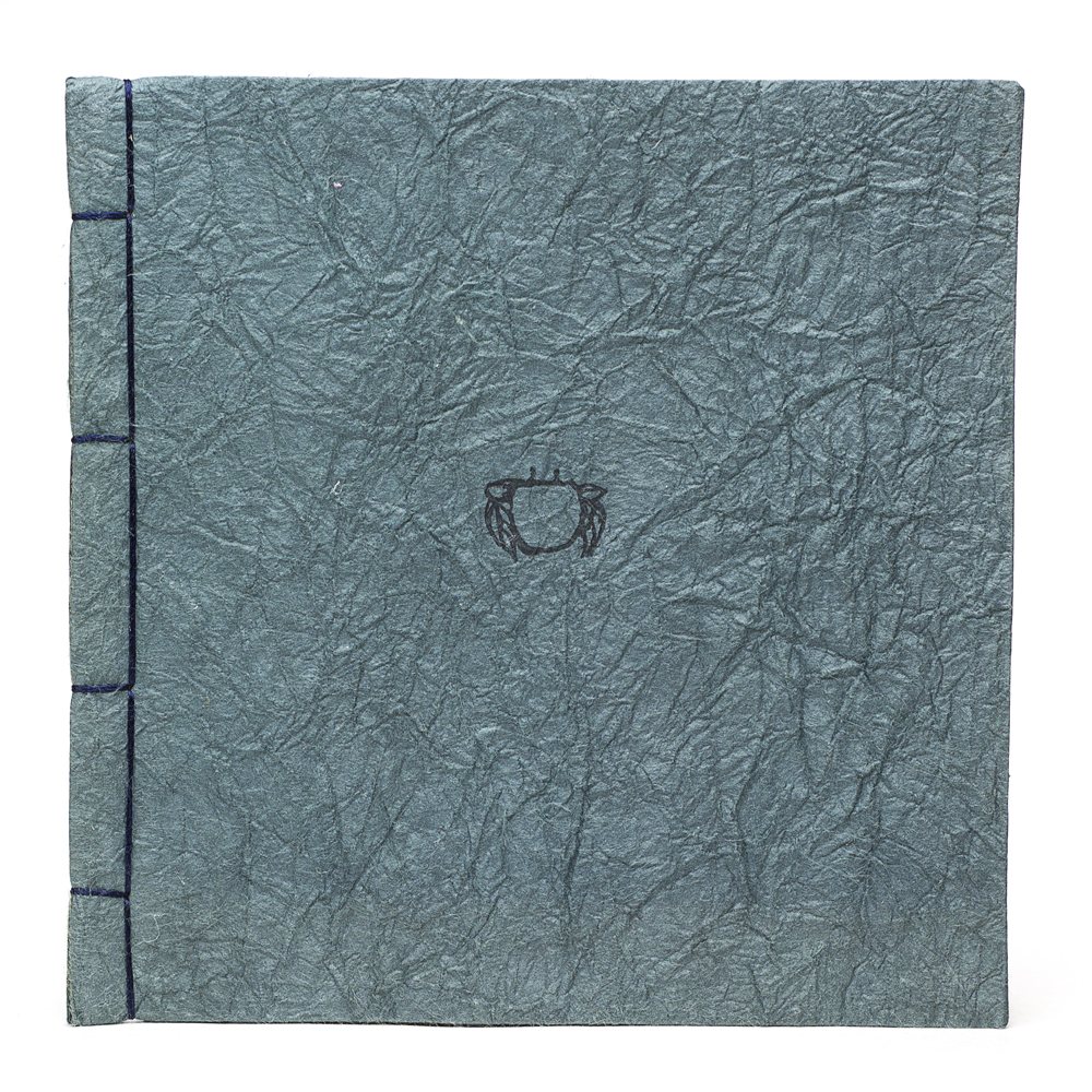
Crab (Andy Farkas)
- Crab byAsheville, North Carolina: [Fablewood], 2010. Edition of 30.
4 x 4"; 7 leaves. Illustration a two color engraving. Pamphlet style construction. Japanese stab binding with dark green wraps.
Andy Farkas: "Crab is a book about a conversation. Specifically, one side of a conversation... what is said and what is left unsaid.
"The paper used is a translucent Asian kozo paper allowing for a visual representation of external and internal dialog. ... The type of paper used for the cover is also used sometimes in clothing which speaks to its flexibility and strength."
Andy Farkas, blog: "This book came from a wonderful collaboration with some folks at Bookworks in Asheville. It represents that duplicitous little voice in our head that speaks to our frustrations as well as our deeper loves, but the actual external expression is something altogether different...a little toned down...or hidden...and easily distracted."
blog.fablewood.com

Duncan & Imogen (Mukti Nurya Cerio)
Tuscaloosa, Alabama : Honey Tree Press, 2010-2011.
"This book was printed in the autumn of 2010 in Tuscaloosa, Alabama; using Centaur and P22 Dearest fonts. There is hand coloring on the images with prisma colored pencils. Fifteen copies are printed on Arches text wove paper with marbled endsheets. The remaining fifteen are printed on handmade cotton rag and linter paper made at the Lost Arch Papermill."--Colophon, [1st] volume.
"This book was printed in the spring of 2011 in Tuscaloosa, Alabama; using Centaur and P22 Declaration fonts. Fifteen copies are printed on Rives paper. The remaining fifteen are printed on handmade cotton abaca paper made at the Lost Arch Papermill."--Colophon, [2nd] volume
Each volume contains addressed envelopes and letters, addressed to Duncan Brooke or Imogen Spencer.
Full Circle (Julie Chen)


By Julie Chen
Berkeley, California: Flying Fish Press, 2006. Edition of 100.
Rotating wheel in a 15" x 15" x 3" silk-covered box.
A spinning wheel — that the reader controls and rotates — suggests a clock, or progressive stations along some journey. The contents of the book are viewed by turning a wheel and pausing whenever text and image are centered in 4 windows. At 3 intervals a drawer lines up with the opening in the front of the box. Pulling a tab reveals a tongue-like 3-dimensional diagram of the mind and heart in relation to each other.
The subject? The clue is on the face of the top of the box: an array of intersecting circles hold phrases like "Things I was told to believe in," "Things I would like to believe in," "Things I used to believe in." Full Circle is about belief, or more pointedly, about cycles of belief.
Heart Assortment: A Bittersweet Sampler
- Heart Assortment: A Bittersweet Sampler: Nine Poems byCall Number: Moody Polk Books N7433.4.R37 H43 2002Publication Date: 2002Issued in a red velvet valentine candy box, lined in gold with a heart shaped metal decoration on top cover ( 30 x 30 x 3 cm.) In an edition of 14. Baylor's copy is number 5 and is signed by the artist.
Poems of lost loves, longings, regret and the bittersweet nature of love. Each poem is printed letterpress in a different font, in nine shades of red and purple, on Somerset Velvet radiant white paper. Poems wrapped in a red velvet ribbon.

Heart Book VI (Ron King)
- Heart Book VI byLondon: Circle Press, [c. 1996]. Series variant.
7 x 9 x .75"; 78 pages. Altered book. Painted covers. The text block has been cut in a half-heart shape. Signed by King.
Cooking the Books: "A range of Heart Books were made as original items for the V&A [Victoria & Albert] gift shop for Valentine's Day. Discarded books of different size and thickness were cut right through with a jig-saw. Some hearts were hand-painted inside and outside and are removable from the main book block."
This Heart Book uses a discarded Song of Solomon trade edition (Circle Press, 1990) as its base.

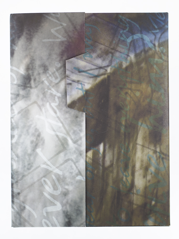
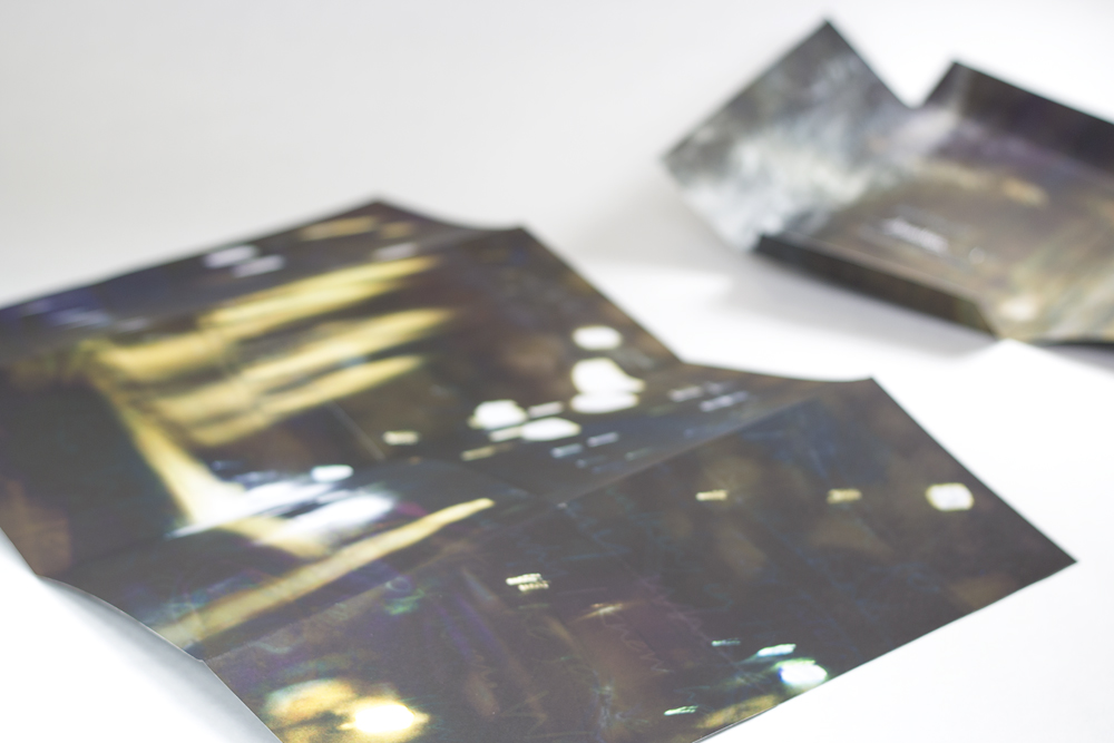
The Heart Wants What It Wants (Lauren Faulkenberry)
-
The Heart Wants What It Wants by
Tuscaloosa, Alabama: Firebrand Press, 2010.
Edition of 70.6.75 x 6.875 x 1.25"; 3 books, each a single sheet folded. Two of the books open to 18 x 24" and one opens to 12 x 24". Images created using woodcuts and photopolymer plates. Housed in clamshell box. Text and illustrations by Lauren Faulkenberry.
Firebrand Press: "This is a series of three books, titled Smolder, Galvanize, and Devour. With a structure similar to a map fold, each book is printed on a single 18" x 24" sheet that collapses to 6" x 6". "Based on the mythology of the Greek furies, this trilogy explores themes of heartache, longing, and obsession, and describes how it feels to be set aflame by another."The books and box can be arranged so that the cover drawings on each combine to form the image of a human heart.


Hole in My Heart (Kumi Korf)
Hole in my Heart
By Kumi Korf
Ithaca, New York: Rikka Press, 2010. Edition of 20.
13.4 x 13.4 x 1.5" lidded box containing 12.75 x 12.75 x .5" octagon. Four triangles and four squares connected by hinges form a folding octagon structure with a hole in the center. Four 3.75 x 3"books with 10 leaves each slip into cavities that have been cut into the outside edges of the four squares. The squares and triangles are covered with papers that are Kumi Korf's intaglio prints printed by Christa Wolf on Akatosashi paper. Text is set in Electra and letterpress printed on Kitakata paper by Roni Gross. Box lid covered with a print with title inset.
By folding and twisting the octagon, multiple symbolic structures can be created. The hidden books contain poems by four Japanese court women who used poetry to fill the holes in their hearts.
Colophon: "The concept of this book, the structural design and the selection of the four poems from Japanese women are by the artist. The four poems are: Ono no Komachi (9th century), Izumi Shikibu (10 -11th century), Hachijo-In no Takakura (13th century), and Go-Saga In Chunagon no Suke (14th century).
"Across the centuries, their sorrow and sadness reach us in our hearts. Creating their poetry in turn, each one of them gracefully accepted the human condition. In expressing their grief, the holes in their hearts were filled with poetry and the play of words using 5-7-5-7-7 syllables of the tanka format."
Kumi Korf: "The women poets in my Hole in My Heart were women serving at Emperors' courts in order to make their wives' surrounding culturally glamorous. They had cubicles partitioned by screens made of beautiful fabrics. My structure of Hole has two distinct such cubicle positions – two cubicles each."

How To Love Someone Forever (Ellen Knudson and Kevin Knudson)
- How to Love Someone Forever byStarkville, Mississippi: Crooked Letter Press, 2004. Edition of 50.
6 x 8" with 34 pages and one fold-out. Letterpress printed from metal typeand photopolymer imagery from line drawings of weeds. Double pamphlet sewn, German lapped binding with handmade paste paper covers and cloth spine. Accompanied by a 8 x 17.75" broadside. Text handset using Goudy Old Style #394 and Caslon metal types. Printed on dampened Hahnemuhle Bugra papers in mint and marble gray. Paste paper covers handmade on mint Bugra.
A broadside, Valentine Sestina, accompanies this collection of poems written by Kevin and Ellen Knudson. The poems were written by the couple for one another and for their son. The illustrations by Ellen Knudson are line drawings of weeds and other plants that go unnoticed. The poetry is about the "every day" of relationships. The poems are about finding beauty in the "every day" actions that can be taken for granted and go unnoticed, much like weeds.

How to Write A Crazy Love Letter
-
How to Write A Crazy Love Letter byPublication Date: February 2012COLOPHON: 2,473 broadsides letterpress printed over 9 days, by eight people, using woodtype (over 100 years old), metal type (also very old) and photopolymer plates (brand new). Many broadsides printed to the music of Beethoven, some printed to the music of the 80’s, and a few printed in silence.
Written, designed, and organized by a girl in Salt Lake City after a cellphone conversation during a rainstorm in later September with her best friend from Texas.


I Love You! (Peter and Donna Thomas)
- I Love You! byCall Number: Moody Polk Books N7433.4.T534 I2 2000Publication Date: 2000[3] double leaves ; 32 mm.
Note Bound in maroon leather. On pink paper. First leaf has a red heart, 2nd has the text "I love you!" and 3rd is the colophon.
"Made by Peter and Donna Thomas, 2000"--Colophon.

Love and Marriage (Nava Atlas)

-
Love and Marriage byNew Paltz, New York: Amberwood Press, Inc., 2008. Edition of 100.
7 x 10.5"; 32 pages. Digital offset printing. Saddle-stitched.
Nava Atlas: "Love and Marriage is an altered comic book utilizing art from the 1950s. The original dialog has been removed, replaced by dry deadpan banter, between male and female characters on the mythology of modern marriage, supermoms, media’s obsession with domesticity, over the-top weddings, and monogamy. Interspersed are ads from the era, whose absurdity is left intact, in their original, unaltered state."
The comic books that supplied the art are credited on the inside of the back cover.
Love Is Everlasting (Peter and Donna Thomas)
- Love Is Everlasting byCall Number: Moody Polk Books N7433.4.T534 L68 2003Publication Date: 20031 v. (unpaged) : col. ill. ; 35 mm.
Note "This book was made by duplicating a one-of-a-kind book that Donna hand painted and hand lettered. The text is in both Hawaiian and English. It is a proverb, "Love is worn like a wreath through the summers and the winters, love is everlasting." The book was color copied onto Peter's handmade paper and then accordion bound between covers that are wrapped with Hawaiian tapa cloth, a traditional cloth-like material made by pounding the inner bark of the mulberry tree. A paper label, like a cigar band, holds the book together."--Peter and Donna Thomas' website (accessed October 2, 2013).
Baylor's copy is number 37 of 100.

Lover's Knot (Roni Gross)
- Lover's Knot byCall Number: Moody Polk Books N7433.4.G77 L68 2009Publication Date: 20091 sheet ([2] p.) : ill. ; 16 x 16 cm.
Signed by the artist.
A volvelle, printed on both sides; housed in cut-paper sleeve and printed paper envelope.


Mallard (Jesse De Long and Sonja Rossow)

Mallard- Jesse De Long and Sonja Rossow
Gordo, Alabama: Curly Head Press, 2012. Edition of 22.
link to record in Baylor Libraries catalog: http://bearcat.baylor.edu:80/record=b3800978~S10
4 x 6 "; 8 shaped leaves printed on handmade cotton and abaca paper treated with a watercolor and salt technique. Letterpress printed wtih photopolymer plates. Bound with thread and wood. Slipped in envelope cloth wrapper.
The artist and poet met through the collaboration developed between the University of Alabama's Book Arts and Creative Writing programs and this work marks their third collaboration.
". . . Not parting the water, no, but moving its shape aside the way I would a lover. . . ."
migration: a field guide to love that was and might have been
- migration: a field guide to love that was and might have been byGordo, Alabama: Firebrand Press, 2011. Edition of 45.
5.5 x 8"; 72 pages. Letterpress printed with photopolymer plates. Printed on handmade papers made of abaca, cotton rag, kozo, and corn from the artist's father's garden. Perfect bound paper over boards. Text, images, printing, and binding by Lauren Faulkenberry.
Firebrand Press: "This book is comprised of two narratives. One is a collection of anecdotal stories that allude to romantic encounters that the narrator experienced or imagined. The other is based on observations of bird behavior that mirror the behavior of the narrator."

Paradise: Nature, Stardust, Music, and Romance (Peter and Donna Thomas)
- Paradise: nature, stardust, music & romance byCall Number: Moody Polk Books N7433.4.T534 P37 1999Publication Date: 19991 v. (unpaged) ; 70 mm.
Note Title transcribed from 5 flags affixed to dowels arranged sequentially in a wooden frame attached to spine of cover.
"For not only/in my eyes/is paradise./Dante"--Verso of flags.
Edition limited to 42 copies. Baylor's copy is number 17.
Postscript (Roni Gross)
- Postscript byPublication Date: 2011letterpress, linoleum
13" x 11
$45
wood type, polymer plates
edition of 60

r & J: the txt msg edition (Elizabeth Pendergrass & John Hastings)
- r & j: the txt msg edition byEverett, Washington: John R. Hastings, 2008. Numbered Edition.
5 x 1.8"; 18 pages. Accordion-fold. Printed on an HP Laser Jet 2100. Font: Antigoni. Housed in a plastic cell phone cover secured with magnetic clasps that slips into a sequined purse. Because the phone covers and holders are found objects, each book varies slightly in appearance.
John Hastings, introduction: "The language in Shakespeare's plays has stood the test of time, but could it survive a translation into text messages by a modern teenager? I asked my 16-year-old granddaughter to rewrite the balcony scene from Romeo and Juliet as if it had all happened between two teens text messaging on their cell phones."
J: y do y have 2 b romeo? if u change ur name & promise u luv me ill change mine

Reciprocal (Louise Levergneux)
-
Reciprocal / Réciproque bylimited edition in 12 copies numbered and signed, 21 single sheets unpaginated, 8.25 x 8.25 x 0.25 in. binding: a supple sand colour crepe paper sewn in Japanese style with red linen thread. The envelope that contains the book is sand colour crepe paper lined with Japanese red paper. A label and fake stamps are glued onto the envelope. substrates : pages printed on Aspen Moguls paper with an Epson printer.
ARTIST STATEMENT:
As with all my work, Reciprocal is a collection and is also autobiographical. Reciprocal recollects the memory of words and emotions between two lovers while enduring a separation consisting of many kilometers/miles between them. Reciprocal consists of numerous letters collected over a period of 9 months but only the letters and cards that corresponded to the same date sent back and forth were chosen to be part of the book. The book might also have been entitled "July-August" since most of the dates included seem to be in this time period.
I first scanned all the information including the hand written text inside the cards, the envelopes stickers and stamps. The feeling of separation was transformed by fusing the images and texts into one image using Photoshop. Some of the text disappears into the image as to keep the viewer wondering. Each page follows the sequence of dates. The colour red for the inside of the envelope was chosen to bring passion to memory.
http://www.louiselevergneux.com/


Secret Love (Amandine Nabarra-Piomelli)
-
Secret Love byIrvine, California: Amandine Nabarra-Piomelli, 2007. Edition of 45.
5.25 x 7'', 8 unnumbered pages closed; opens to a one sheet book 12.5 x 18.5". Pigmented digital prints on matte paper. Laid in a matching wrapper with slip/slot closure.
Secret Love is constructed as a one page "hidden book" structure folding down to four spreads.
Amandine Nabarra-Piomelli: "One of my best friends recently told me she had been loving a man, secretly, since she was in college. Shocked by the news, I went roaming the freezing winter streets of Paris at night, trying to make sense of her conflicting feelings. As I was walking and taking pictures I envisioned painterly images reminiscent of the Impressionist movement and like its painters I wanted to catch particular fleeting impressions of color and light representing my state of mind and my friend's dilemma. I experimented with layering multiple photographs to emphasize sensations of solitude, secrecy, loneliness, and missed opportunities. The 8-page book is nested in a jacket. It unfolds to reveal the "secret" which is written but not readable. ..."


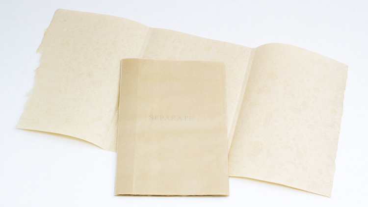
Separate (Karen Hardy)
- Separate byCall Number: Moody Polk Books N7433.4.H368 S47 2012Publication Date: 2012Separate, 2012
handmade flax and abaca paper with letterpress
5.5" x 8.5"
"Separate considers the various roles we fill throughout our lives as both caregiver and dependant. It examines the conflict between the instinct to nurture and the desire to be unencumbered, the push and pull between dependence and independence, and our vacillation between vulnerability and strength." --Karen Hardy

Should Cards (Sarah Smith)
Should cards : package no. 1: dating / Sarah M. Smith.
Beverly, MA : Olfactory Press, 2009
"Images of desirable (?) men on one side; on the reverse, hints for meeting them. Tongue firmly in cheek, but which cheek?"--Vamp & Tramp, Booksellers website (accessed 2-2614). Baylor's copy is number 121 of 125 and is signed by the artist.

Strike Gently (McFadden/Elsaesser)

-
Strike Gently byLetterpressed cover & linoleum block prints, embroidered muslin bag, photobooth strip, fishing hook, matchstick, pearl, receipt & carbon paper, Number 15 from an Edition of 20, 4 ½ x 5 inches,
ARTIST STATEMENT:The title and form of Strike Gently are derived from the instructions and format of a matchbook. It addresses the stages of a relationship as combustibility and the chances for a spark. The paper’s grey scale is meant to evoke both emotional variance and the ashes of a spent match. The first chapter, ‘Dear’, consists of a series of notes or letters between potential lovers, attempts to make contact. ‘Catalysis’ addresses the causes of movement, from motion towards that which sustains, to thoughtless, drifting movements. The chapter, “. .” contains Venn diagrams as applied to personal connection; what is shared in contrast to what cannot be common ground. The last diagram, a single carved-out circle, suggests either complete unity or total isolation, and is followed by a piece of carbon paper with the translucent outline, or impression, of the word “struck.” The carbon pages correspond to themes of pressure, what is made visible by light, as well as the proof or remainder of what has transpired. The section ‘I.We.You’ further explores moments of oneness or separateness, using only the pronouns I, we, and you, to achieve a sense of universal accessibility. ‘The Language of Flowers’, a series of prints arranged in a match-like configuration, references the Victorian-era practice of sending coded messages via flowers. ‘The Argument’, unsurprisingly the last chapter, consists of seven feet of receipt paper detailing an argument between unidentified speakers. The scroll is bound by thread secured on either end by a fishhook and a pearl, which must be “cast out,” or pushed through the page to release the argument. The overwhelming length and complicated binding of the argument force the reader to move physically away from the book and to a certain extent disassemble it. After the scroll has been unraveled it cannot be brought back to its original state, a reflection on the emotional ramifications of an argument. This kind of experience-oriented reading is the overarching goal of our work: to create books that are permanently altered by the reading process.
Theia Mania
- Theia Mania byCall Number: Moody Polk Books N7433.4.B33 T44 2010Publication Date: 20103 books : ill. ; 13 x 13 cm., 10 x 3 cm., 3 cm. diameter + 1 herb sachet + 1 CD (15 min. : digital : 4 3/4 in.)
Note Limited edition of 36 copies.
"This project is the result of an intermingling of stories told by those who have been struck by a sensation of instant connection with another. In the classical world such pricks from a dart of Eros were called 'Theia Mania' (madness of the gods). Heidi Zednik and I began by collecting audio version of stories told by those willing to participate in the project. We recorded 12 such stories and these are the basis for both the text and audio portions of this piece. Two of the stories I wished to include could not be told by their subjects, so I wrote my own versions, presented as oral presentations [on the CD]"--A. Bailey, Colophon.

El Torero ya la bailarina (Ellen Ziegler)
Ellen Ziegler had this to say about her work: "The love story of a young ballerina (my mother) from New York's Ballet Theatre, in residence at the Palacio de Bellas Artes in Mexico City. She fell in love with Cantinflas, Mexico's most famous actor and comedian (and a bullfighter.)"
Hard-bound limited edition, hand-stitched, paper with cloth corners, 8" x 11".
Photos hand-tipped in, archival inkjet printed.
Text in Spanish and English.
Overlays hand-typed on vintage onionskin paper in the Portal de Evangelistas, Mexico City.
Click here to for a video of Ellen Ziegler talking about her book El Torero y la Bailarina.

Turn Over Darling (Ron King)
- Turn Over Darling byLondon: Circle Press, 1990. Unlimited numbered edition.
20 x 15cm. Designed and drawn in wire on Khadi pure rag-made paper. Six drawings when folded and juxtaposed in sequence, make for eleven reclining nude images which change position from front to back view. In slipcase.
Embossed and debossed images of a womanly figure reveal themselves as the reader dips through each page. Wire forms were pressed into the dampened sheets of each spread to create a delightful and lighthearted erotic sequence.
"The female nude, that favored subject of art, is given a whole new twist - several of them, in fact - in Ron King's 'Turn Over Darling,' wordless and all in white. The initial intaglio image, the upper part of a woman, reverses with a turn of the page and, now in relief, joins with a facing lower body to form a classic image of a reclining nude but ... another turn of the page and the lower part, in intaglio, meets a new upper part, forming a new view of the nude. The pages turn and for each upper half of the body, there is a lower half that then becomes the lower half for the next upper half, with ongoing reversals between relief and intaglio. Take a guess at the final image. With the use of a wire impressed in the paper pulp, the figures are drawn with Matisse like clarity. Sensuous, classic, witty, filled with movement - in 'Turn Over Darling,' the artist finds a new way to love that darling woman, and a new way to express profound appreciation for the beauty of the female form." [Beyond the Text: Artists' Books from the Collection of Robert J. Ruben by Yvonne Korshak and Robert J. Ruben]

A Very Valentine (Roni Gross)
- A Very Valentine byPublication Date: 2010letterpress
7" x 13" panel

The Wedding Plans (Kirstin Demer)
- The Wedding Plans byCall Number: Moody Polk Books N7433.4.D46 W43 2006Publication Date: 2008Chicago, Illinois: Kirtin Demer, 2006. Edition of 24.
1.75 x 2"; 25 pages. Heart shaped pages. Miniature accordion book. Laid in heart-shaped lidded metal box with transparent panel in lid to reveal pink ribbon with title laid across first page. Ribbon also serves to lift book from box. Cotton paper pulled by Loni Diep. Handset and printed by artist. Roman 12 pt. type.
Original poem by Kirstin Demer about wedding plans, including grandma as the wedding planner.


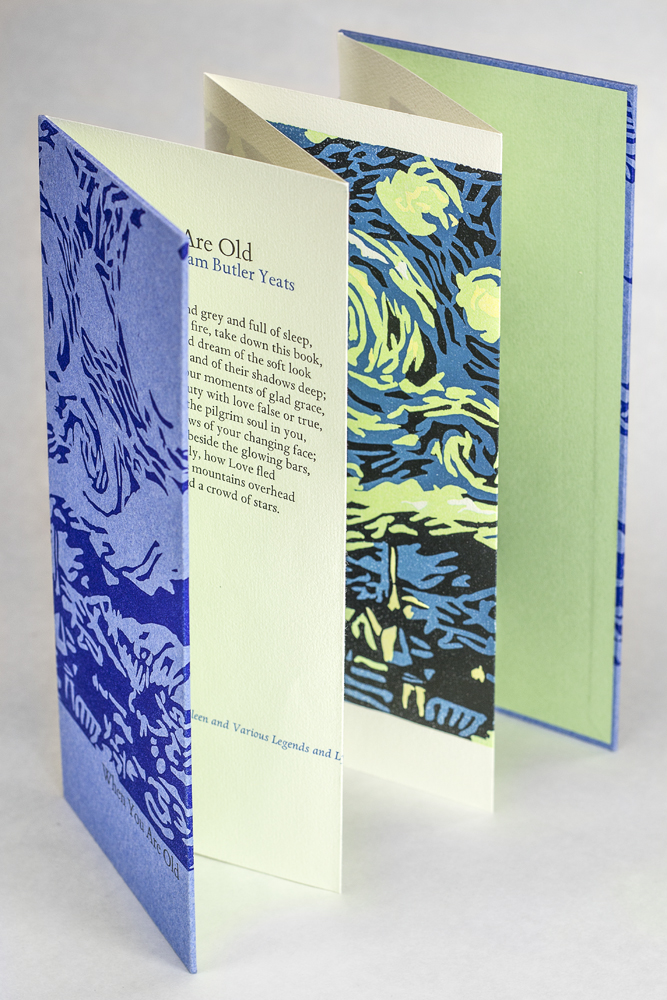
When You Are Old (Yeats/Amy Pirkle)
- When You Are Old byCall Number: Moody Polk Books PR5904 .W38 2006Tuscaloosa, Alabama: Perkolator Press, 2006. Edition of 30.
9 x 4 ", extends to 9 x 24 "; 4 pages. Accordion structure. Text printed letterpress in two colors, the image, a reduction linoleum block, in four. Cover papers 100% cotton rag handmade by the artist.
1 folded sheet : col. ill. ; 23 x 41 cm. folded to 23 x 11 cm.
Note Cover title.
"Letterpress printed from metal types and reduction linoleum block by Amy Pirkle of Perkolator Press, Autumn 2006"--P. [4] of cover.
A sheet folded concertina-style to form four leaves, with left and right ends glued to boards for covers; no spine. The sheet is printed only on one side, with the poem by Yeats on one leaf and an illustration, based on Van Gogh's Starry Night, in blue, green, yellow and black, running across the other three. The covers are printed in a design recalling the interior illustration, with title on front and colophon information on back.
Local Note Baylor's copy is number 29 of 30, signed and numbered by the artist.
Amy Pirkle: "This is my favorite poem by W.B. Yeats. The speaker in the poem asks the young woman he loves to remember him when she is old and grey and full of sleep. He wants her to know that although other men loved her for her beauty or grace, he was the one man who loved the pilgrim soul in her. He wants her to regret the fact that she did not return his affections, and to murmur, a little sadly, how Love fled and paced upon the mountains overhead and hid his face amid a crowd of stars.
The image, a four color reduction linoleum block, is a study of Van Gogh's Starry Night and perfectly accentuates the words of the poem."

Your Favorite Love Songs (Miriam Schaer)
-
Your Favorite Love Songs by
In this work, multimedia book artist Miriam Schaer has created a unique (one-of-a-kind) heart-shaped book – a compilation of multi-generational love songs. The shaped book has historic precedent, and heart-shaped books date back to the middle ages, where they were often prayer books. In modern times, love has many additional meanings, and romantic love is a more modern conceit. About this work, Miriam says:
This book is one of the first shaped books I ever made. I loved the form, and only later learned about the historic significance of the structure. In many ways it opened my eyes to the possibilities of books. When I learned about an historic structure called the girdle book-it changed the course of my artistic practice. Girdle books were codex books, with an extra length of fabric or chain at the head of the book, so the book could be wrapped or tucked into the waistband or girdle of the monks (usually, or nobility) so one's prayers could always be at hand. I realized that we still have needs and carry around prayers, but sometimes of a different source and my books could be meditations on prayers, seeking answers to questions that often have none.


For much of her artists books, Miriam uses garments — girdles, bustiers, brassieres, aprons, children’s’ clothes — as means of containment. Inside these stiffened, shaped, embellished enclosures, she places books and other objects that document her explorations of feminine, social, and spiritual issues.
Ms. Schaer is a recipient of an Artists Fellowship from the New York Foundation for the Arts. Her work has been exhibited in the Mary H. Dana Women Artists Series at Mabel Smith Douglass Library, Rutgers University in New Brunswick, NJ, the oldest and longest-running exhibition series dedicated to showcasing women artists in the United States, as well as at the Feminist Art Base in the Brooklyn Museum’s Elizabeth A. Sackler Center for Feminist Art. Ms. Schaer’s work has been shown in the Cheongju International Craft Biennale, South Korea, and in Imagining the Book Biennale at the Bibliotheca Alexandrina, Alexandria, Egypt.
Miriam Schaer lectures and teaches books structures and printmaking at universities and art centers in the U.S. and abroad. She also runs teacher training and artist workshops, and taught in artist-in-the-school programs throughout the New York region. Venues in which she has taught and lectured include Sarah Lawrence College, Colorado College, and Rutger’s Center for Innovative Paper and Print, Memphis College of Art and Design; Facultad de Bellas Artes de Universidad de Castilla la Mancha in Cuenca, Spain; the Graphic Artists Union in Tallinn, Estonia; Cinema Rex in Belgrade, Yugoslavia; and the Center for Book Arts and the Lower East Side Printshop in New York City. She currently teaches in the Interdisiplinary MFA in Book and Paper at Columbia College in Chicago.
To see more of her work, visit: http://miriamschaer.com/
